
Legible
UX/UI Design for e-Commerce
An online bookstore in need of a unique web presence.

Role
Duration
Tools
Team
UX/UI and Product
Designer
4 Months
AdobeXD and Photoshop
SurveyMonkey, OptimalSort
1 Marketing Manager
1 Product Designer (me)
Legible is an online bookstore looking to provide a more individualized reading experience. Not only serving as an e-commerce space, there is also an app to help you track your reading and keep you motivated to learn.
Background
For this project, I was tasked with giving this brand a holistic online presence to match their unique objective. As an e-commerce space, they obviously wanted to provide a competitive shopping experience to their customers, but they also wanted to build a relationship with the reader through tailored suggestions, interactive quizzes and reading trackers. This would make reading more fun for the user, increasing the number of titles they consume and providing accurate suggestions for the next one.
Problem
Most online bookstore currently suggest based off of algorithms tracking your purchase history. This doesn't take into account if the reader actually enjoyed the book they purchased, nor does it reflect product returns.
Solution
Legible treats book reading like a game - knowing that avid readers have active imaginations, we tailor suggestions based on quizzes and games to get to the root of our customer's individual story.
Legible's Business Goals
-
Having clear ways of locating specific product
-
Uncovering titles based on personal taste
-
Providing an efficient way of purchasing one or more items
Who are our Users?
Who are we designing this site for? What needs to do they have that are not being met in the market already? To understand this, I was provided with 3 User Personas that were identified as potential customers.


Danielle, 45 years old
About: Enjoys keeping up to date with the hottest reads. She leads her book club so she wants books that will impress her team.
Values: - Relevance (of the moment content)
- Product Reviews
Goals: - She gets many compliments on her book club picks and wants to keep it up
- She wants a tool to keep her on track to ensure she finishes the book by her next meet, reducing the rush to finish as the date approaches
Amir, 23 years old
About: English student with limited time but needs to read certain classics for school
Values: - Efficiency
- Likes to have options between style of book, tends to opt for audiobooks
Goals: - To stay on track in his reading before he is quizzed on it
- To be able to consume books during his commute through audiobooks
Based on the results from the User Personas, I was able to identify the key requirements to meet the needs of the users. They consist of:
-
Product Search to easily find specific titles
-
Tailored suggestions + similar products
-
Clear genre organization
-
Detailed product options (e-books, paperbacks, audiobooks)
-
Product reviews
-
Seamless check out process
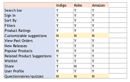
What is our Competition?
To better understand the competitive landscape in this space, I looked at our direct competition in Indigo, Kobo and Amazon. The goal of doing this was to identify common features and to identify opportunities that would allow Legible to stand out in comparison to the others.
My primary take-away from this study was in realizing that all the online bookstores were similar in how products were recommended, emphasizing new releases and "Customers also looked at" lists, where as no other allowed the user to contribute to the type of suggestions being made.
Information Architecture
The next step was to look at the inventory Legible plans on carrying, so that product could be organized in a way that made sense to the customers. I then took the categories they intended on carrying and conducted a Card Sorting sessions with 6 participants.
I started with an Open Card Sort, where the 6 users were told to divide the categories and group them based on what they thought would be found together. I then asked them to name the groups as they would expect to be called.
Once I compiled the results from the Card Sort, I was able to accurately lay out the Site Map using the categories and content within those headers.

User Flows
Creating the user flows allowed me to dig into the steps our User Personas would take to achieve what they intend to do with our product. I considered the top priorities of each of the Personas, as well as the basic functions anyone would need to be able to accomplish such as checking out their purchase.
I treated the 2 User Personas as completely new users and addressing their basic needs of finding a book and making the purchase. Then their individual desires were worked out through Journey Mapping.
Map #1 - This map looks at the interaction to a user coming to our homepage and the steps they take to find what they are looking for

Map #2 - This is the interaction from the Point of Purchase the user takes, whether they are a Registered User or if they choose to complete their purchase as a guest.

Prototyping Phase
Sketching out the site with the Site Map as a guide allowed me to have a tangible idea of what the resulting site could look like. Using these sketches, I was able to test the interaction with participants to ensure I was on the right track to a functional and easy design and ensure business requirements were also being met.
Sketching

Wireframing

-
Product Search to easily find specific titles
-
Tailored suggestions + similar products
-
Clear genre organization
-
Detailed product options (e-books, paperbacks, audiobooks)
-
Product reviews
-
Seamless check out process
Prototyping
1. Homepage
In order to not compete with the imagery from the book covers and the marketing banners, I kept the homepage clean and simple to avoid overcrowding on the home page and reducing cognitive load. To reduce the amount of time it takes for the user to locate what they're looking for, I not only included a universal search bar but also a drop down menu of the genres. The home page also includes a gallery of new arrivals and most popular items that will account for items that the user is most likely to be searching for.
The point of Legible is to introduce more of a sense of community to the online bookstore, so telling the story of what makes us different and our origin story was important to include on the home page. In the footer banner, lesser commonly searched information about the user's account, about the company overall and the social media channels where they can learn more were all included.
One of my users also emphasized wanting to locate audiobooks, so I included that in the menu for like minded users.


2. Product Category Page
Once a user selects one of the shop buttons to a certain category they are then brought to a page that lists the items for that specific category and allows them to filter by a specific options. Being able to filter by ratings allows my user persona who prioritizes the opinions of other readers to be able to narrow down her search with this in mind.
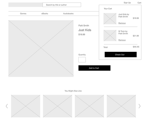

3. Single Product Page
The single page search gives users the opportunity to add items to their cart and either proceed in searching with similar titles suggested below, to read reviews on this specific book or to check out completely.
The layout of the page allows the user to clearly understand where they are located within the site, easily able to go back or to start a new search without having to return to the homepage.


4. Cart Summary Page
When the user goes into the cart pop up and clicks the Check Out button, they are taken to the cart summary page. This is the first step in the checkout process where the customer can review their order and make changes before purchasing. I also included a few different shipping options, including the option to pick up in store at a partnering location free of charge.


5. Checkout Page
Both of my user personas emphasized efficiency as one of their priorities when online shopping, so I gave them the option of checking out their purchase without having to sign up for an account, reducing the amount of time it takes to complete the transaction. As a returning customer with an account, they have the option of using their previous billing and shipping information. I also included a progress bar so that the visitor knows how far along they are in the process and how close they are to completing their order.


6. Usability Testing
With these wireframes complete, I was able to conduct some usability testing with some participants to gauge in the designs were effective. In having them go through the user flows as a third party, I could identify any pain points that may have been overlooked during the design process.
I recruited 4 participants to test the site and asked them to complete 3 different scenario tasks to see how smoothly they could accomplish them. The scenarios included:
1. You want to find a new release for your book club to read in the coming month. The newer it is, the less likely anyone in the club would have already read it, so locate the new releases, select one and then successfully purchase it.
2. Show me how you would find a specific title you are looking for.
3. You want to repurchase a book that you had previously ordered to gift to someone else. Show me how you would do this.
The prominent notes from the tests include:
-
All of the participants were familiar with the check out process and didn't run into any problems
-
A few participants selected the option to pick up in store but were unsure of the address of the location which made them hesitant
-
One participant looked for a promo code input which she commonly uses when purchasing with Kobo
Next Steps
This case study is just the beginning of a larger design process in the development of this e-commerce website.
Moving forward I would like to continue usability testing and determine the visual design aesthetic that would set us apart from our competitors. As those things are fleshed out, I would also like to put more emphasis on the reading community, with brand specific book clubs and an events page within the site to promote book signing events and promotions.
